Choosing new blinds isn’t just about light control and privacy — the colour you pick plays a huge role in shaping the atmosphere of your home. The right shade can make a room feel calm, energising, cosy, or spacious, and it should complement the way you actually use the space. Here’s how to choose blind colours that match both the mood you want to create and the function of each room.
Why Colour Matters in Your Home
Colour affects how we feel. Light, neutral shades can open up a room and create a sense of calm, while darker tones bring warmth and intimacy. Bright colours inject energy and personality, but they may not suit every room or mood. When it comes to blinds, colour is especially important because window treatments take up a large part of the visual space in a room.
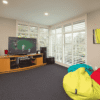
Living Rooms: Warmth and Welcoming
The living room is often the heart of the home, where family gathers and guests are entertained. Warm, neutral tones like beige, soft grey, or taupe work beautifully here, as they create a relaxed and welcoming vibe while still being versatile enough to suit different décor styles.
If your living room gets lots of natural light, lighter-coloured blinds help maintain an airy feel, while darker shades can add contrast and make the space feel cosier.
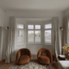
Bedrooms: Calm and Comfort
Bedrooms are all about rest, so calming colours are the way to go. Soft blues, greens, and muted neutrals help create a peaceful retreat, while darker blockout blinds in charcoal or navy are excellent for improving sleep by keeping light out.
If you want your bedroom to feel more luxurious, consider deep, earthy tones like mocha or rich timber finishes in venetian blinds or shutters. These elements add warmth and depth while still maintaining a tranquil mood.
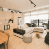
Kitchens: Bright and Fresh
In the kitchen, practicality and freshness matter. Lighter shades like white, cream, or pale grey reflect natural light and keep the space feeling clean and open. For a pop of personality, subtle patterns or bolder colours like soft green or terracotta can create a cheerful, lively atmosphere without overwhelming the room.
Since kitchens are high-traffic areas, it’s smart to choose durable materials like aluminium venetians or easy-to-clean roller blinds that come in moisture-resistant fabrics.
Home Offices: Focus and Productivity
With more people working from home, the colour of your blinds in the office matters more than ever. Blues and greys are ideal because they promote focus and reduce distractions, while warmer neutrals like sand or stone create a balanced, professional environment.
Avoid overly bold colours here — they can be energising but also distracting. Instead, aim for a tone that helps you stay clear-headed and productive throughout the day.
Blinds That Match Your Lifestyle
Your choice of blind colour should reflect both the mood you want to set and the way you use the room. Light neutrals keep things calm and versatile, dark tones add intimacy and drama, while brighter shades bring energy where you need it most.
By considering mood and function together, you can choose blinds that not only look great but also make every room in your home feel just right.